Analyses and Visualizations
This tutorial covers all available analysis types in ProLint and some suggested use cases. You’ll learn how to choose the right analysis for your research question and interpret the results.
Prerequisites
Completed the ProLint Workflow Tutorial
A computed contacts object ready for analysis
from prolint import Universe

# Load and compute contacts
universe = Universe("topology.gro", "trajectory.xtc")
contacts = universe.compute_contacts(cutoff=7.0)
Understanding AnalysisResult
All analyses return an AnalysisResult object with two attributes:
result = contacts.analyze("timeseries", database_type="CHOL")

# Access the data
print(result.data.keys())      # Available data fields
print(result.metadata)         # Analysis parameters used
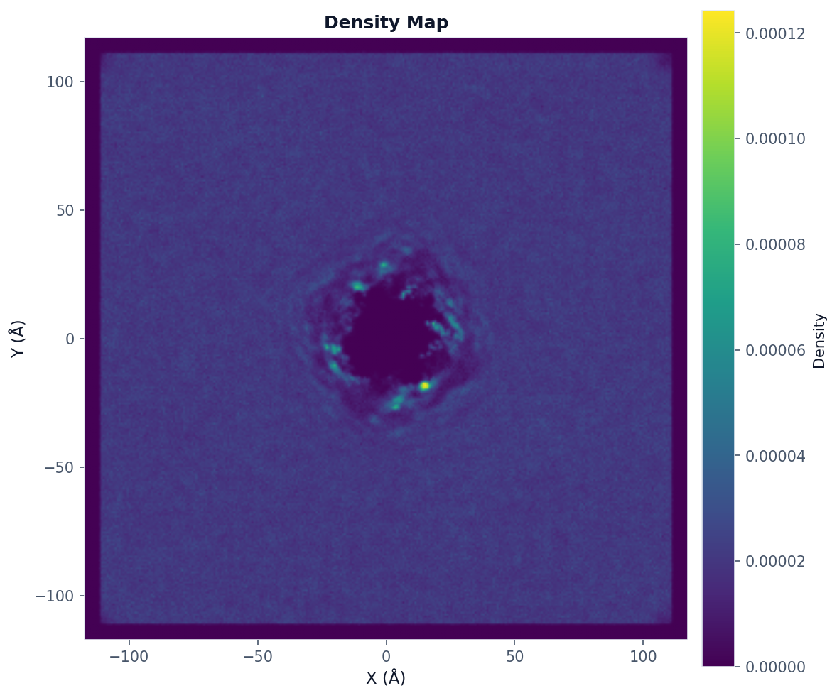
Density Map Analysis
Use when: You want to visualize where database molecules preferentially locate around the query.
from prolint.plotting import plot

# Compute 2D density map
result = contacts.analyze(
    "density_map",
    bins=300,                      # Resolution
    database_types=["CHOL"],      # Database types to include
    frame_start=0,
    frame_end=None,               # All frames
    frame_step=1
)

# Visualize with query outline
fig, ax = plot(
    "density_map",
    result,
    show_query_contours=True,     # Show query position
    colorscheme="viridis"
)
fig.savefig("density_map.png", dpi=150, bbox_inches="tight")
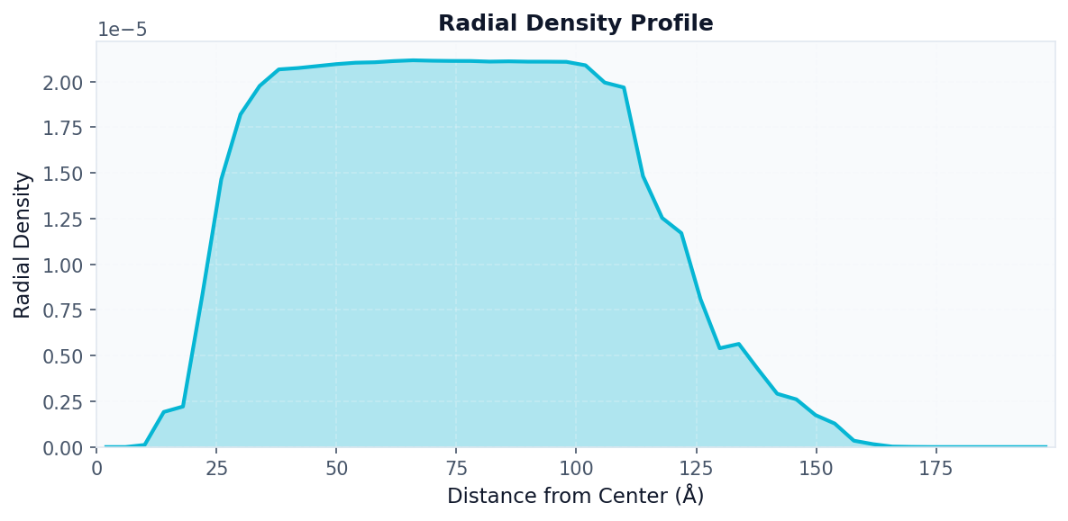
Radial Density Analysis
Use when: You want to see how database density varies with distance from the query center.
# First compute the density map
density_result = contacts.analyze("density_map", bins=50)

# Then compute radial profile from it
radial_result = contacts.analyze(
    "radial_density",
    density=density_result.data["density"],
    x_edges=density_result.data["x_edges"],
    y_edges=density_result.data["y_edges"],
    n_bins=50
)

# Visualize radial profile
fig, ax = plot("radial_density", radial_result)
fig.savefig("radial_density.png", dpi=150, bbox_inches="tight")
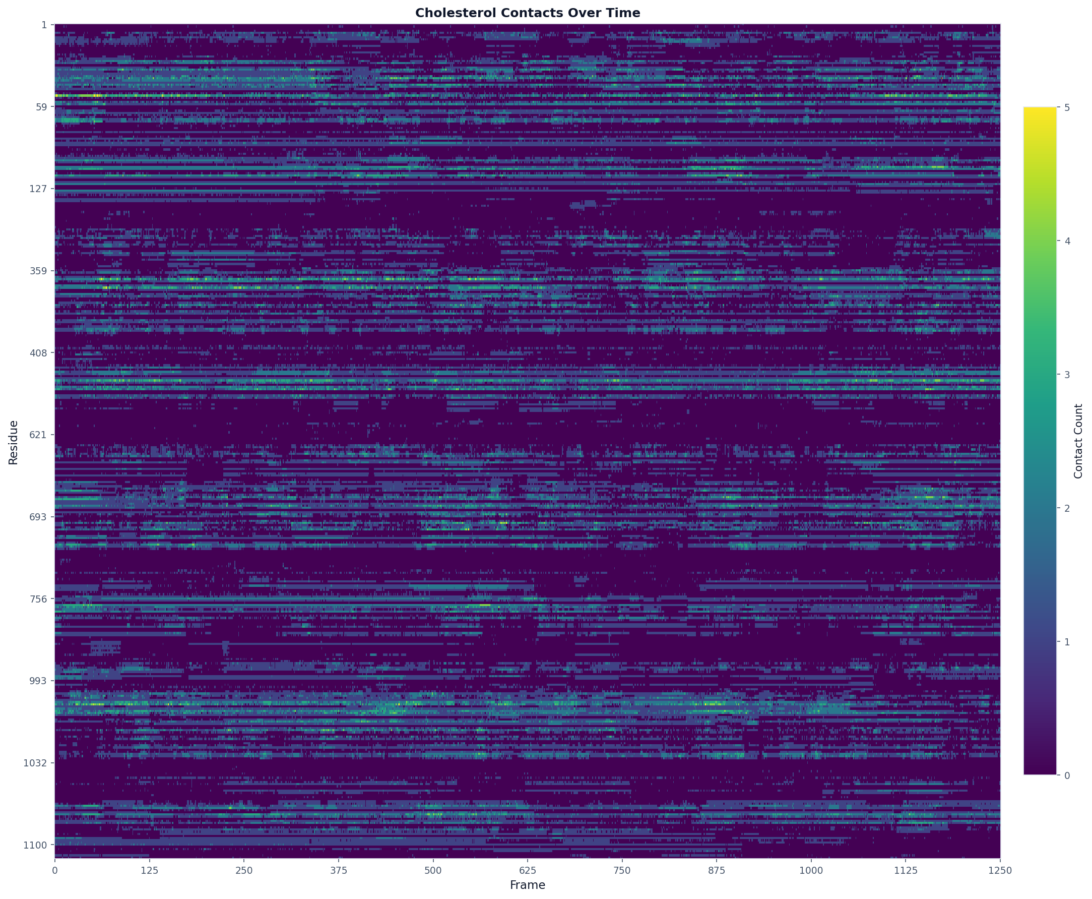
Timeseries Analysis
Use when: You want to see how contact counts change over the trajectory for each residue.
# Analyze cholesterol contacts over time
result = contacts.analyze("timeseries", database_type="CHOL")

# The result contains:
# - query_residues: list of residue IDs with contacts
# - frames: list of frame indices
# - contact_counts: dict mapping resid -> counts per frame

# Visualize as a heatmap
fig, ax = plot("heatmap", result, title="Cholesterol Contacts Over Time")
fig.savefig("timeseries_heatmap.png", dpi=150, bbox_inches="tight", max_display_cols=2000)
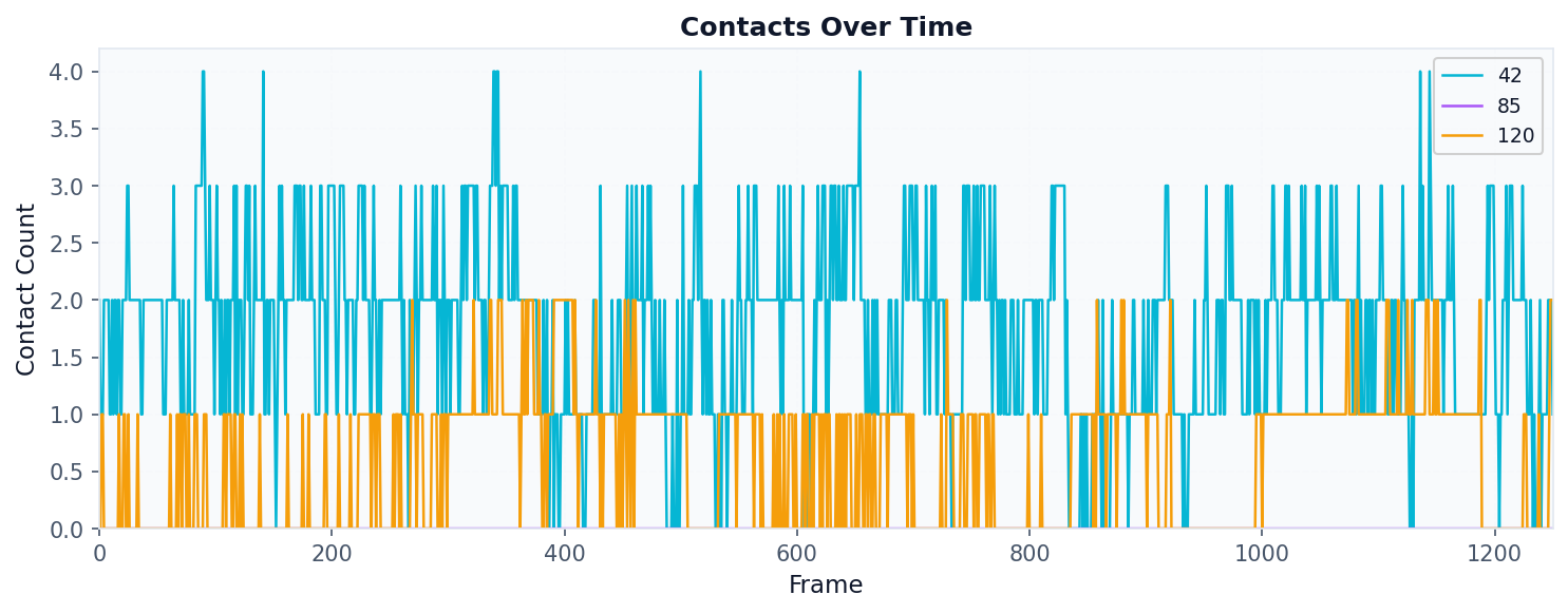
# Or analyze specific residues and plot as line chart
result = contacts.analyze("timeseries", database_type="CHOL", query_residues=[42, 85, 120])
fig, ax = plot("timeseries", result)
fig.savefig("timeseries_lines.png", dpi=150, bbox_inches="tight")
Metrics Analysis
Use when: You want to compare residues by a single metric (occupancy, mean duration, etc.).
# Compute occupancy for each residue
result = contacts.analyze(
    "metrics",
    metric="occupancy",        # Options: occupancy, mean, max, sum
    database_type="CHOL"
)

# Visualize as bar chart colored by metric
fig, ax = plot("residue_metrics", result, colorscheme="prolint", figsize=(20, 5))
fig.savefig("occupancy_bars.png", dpi=150, bbox_inches="tight")
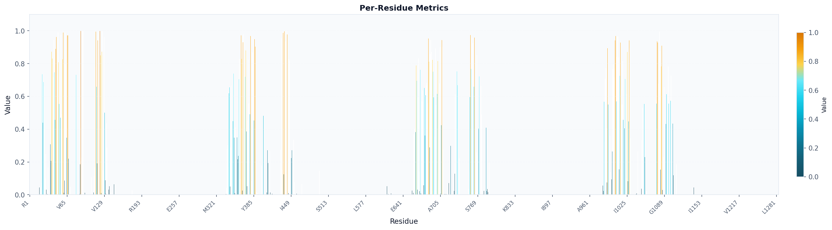
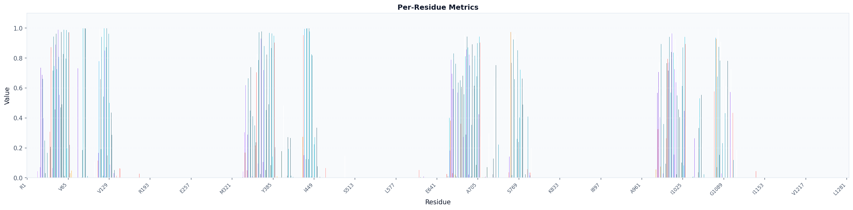
# Visualize as bar chart colored by amino acid (specific for proteins)
fig, ax = plot("residue_metrics", result, colorscheme="amino_acid", figsize=(20, 5))
fig.savefig("occupancy_bars_aa.png", dpi=150, bbox_inches="tight")
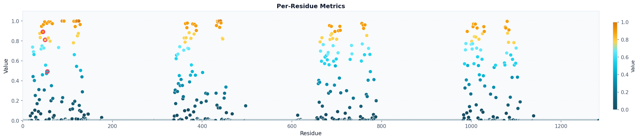
# Visualize as scatter plot colored by metric and highlighting specific residues
fig, ax = plot("residue_metrics", result, style="scatter", colorscheme="prolint", highlight_residues=[45, 50, 55])
fig.savefig("occupancy_scatter.png", dpi=150, bbox_inches="tight")
# Visualize as logo grid (residue letters colored by value)
fig, ax = plot("logo_grid", result)
fig.savefig("occupancy_logo.png", dpi=150, bbox_inches="tight")
![]()
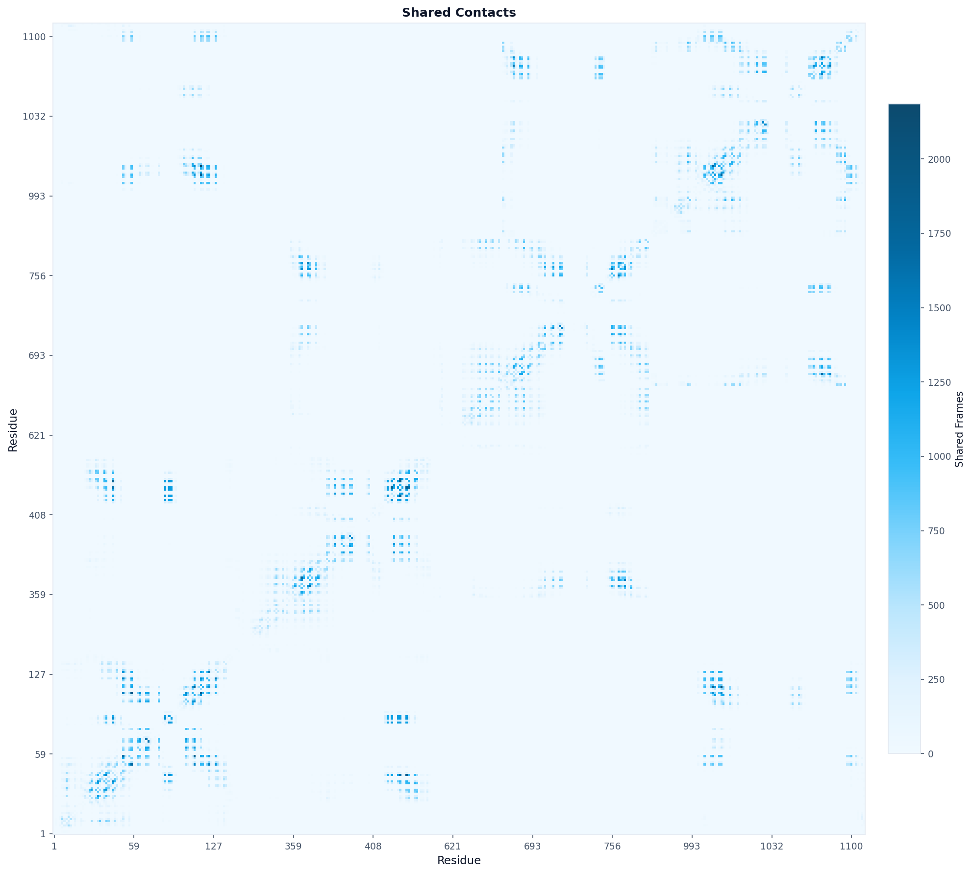
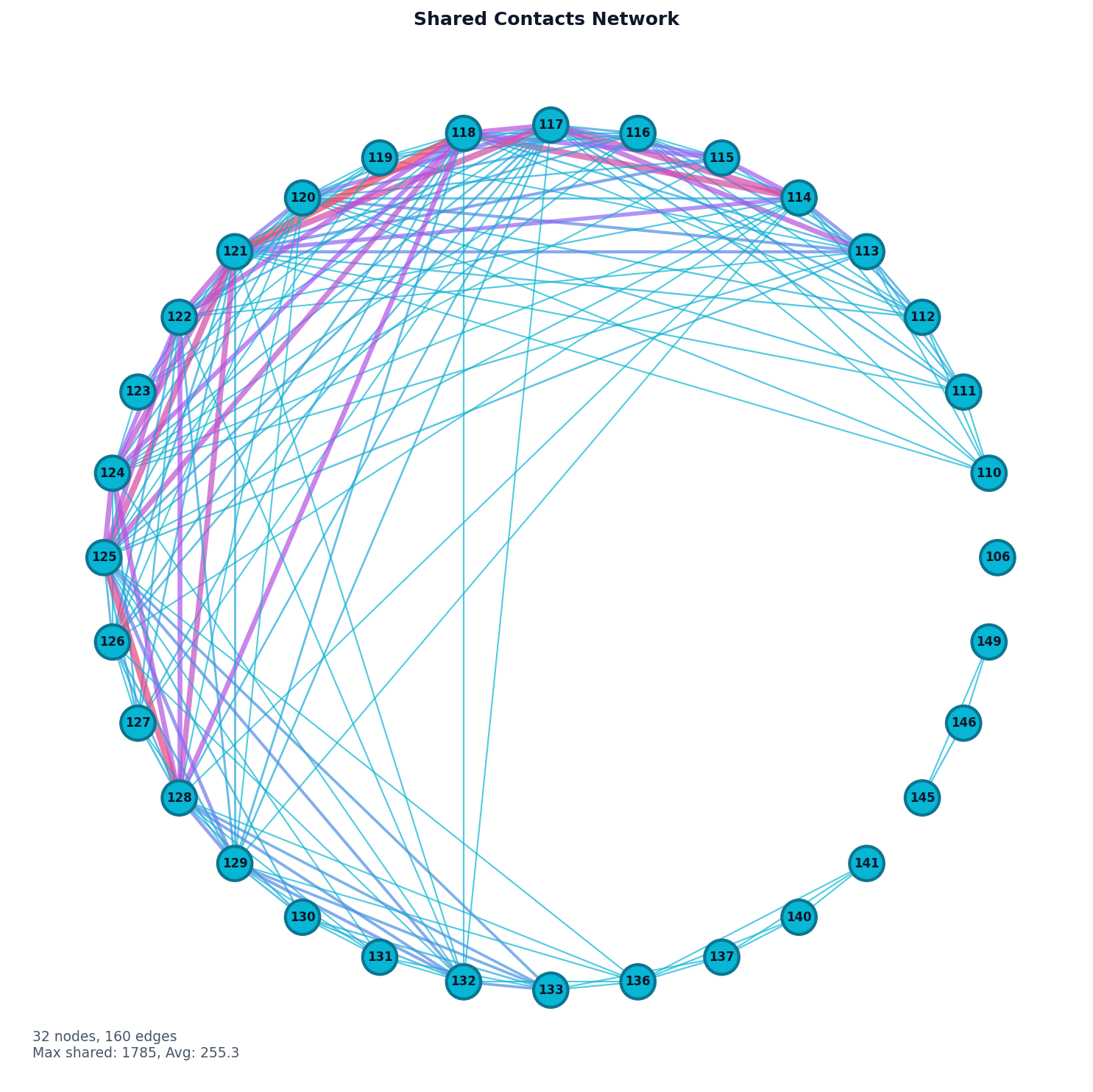
Shared Contacts Analysis
Use when: You want to find residues that contact the same lipid molecules (potential binding sites or cooperative interactions).
# Find residues sharing database contacts
result = contacts.analyze(
    "shared_contacts",
    database_type="CHOL",
)

# The result contains a correlation matrix showing how often
# pairs of residues contact the same database molecule

# Visualize as heatmap
fig, ax = plot("heatmap", result, origin="lower",
                aspect="equal", colorscheme="blues",
                title="Shared Contacts")
fig.savefig("shared_contacts_heatmap.png", dpi=150, bbox_inches="tight")
# Visualize as network graph
fig, ax = plot("network", result, selected_residues=[i for i in range(100, 160)], threshold=1)
fig.savefig("shared_contacts_network.png", dpi=150, bbox_inches="tight")
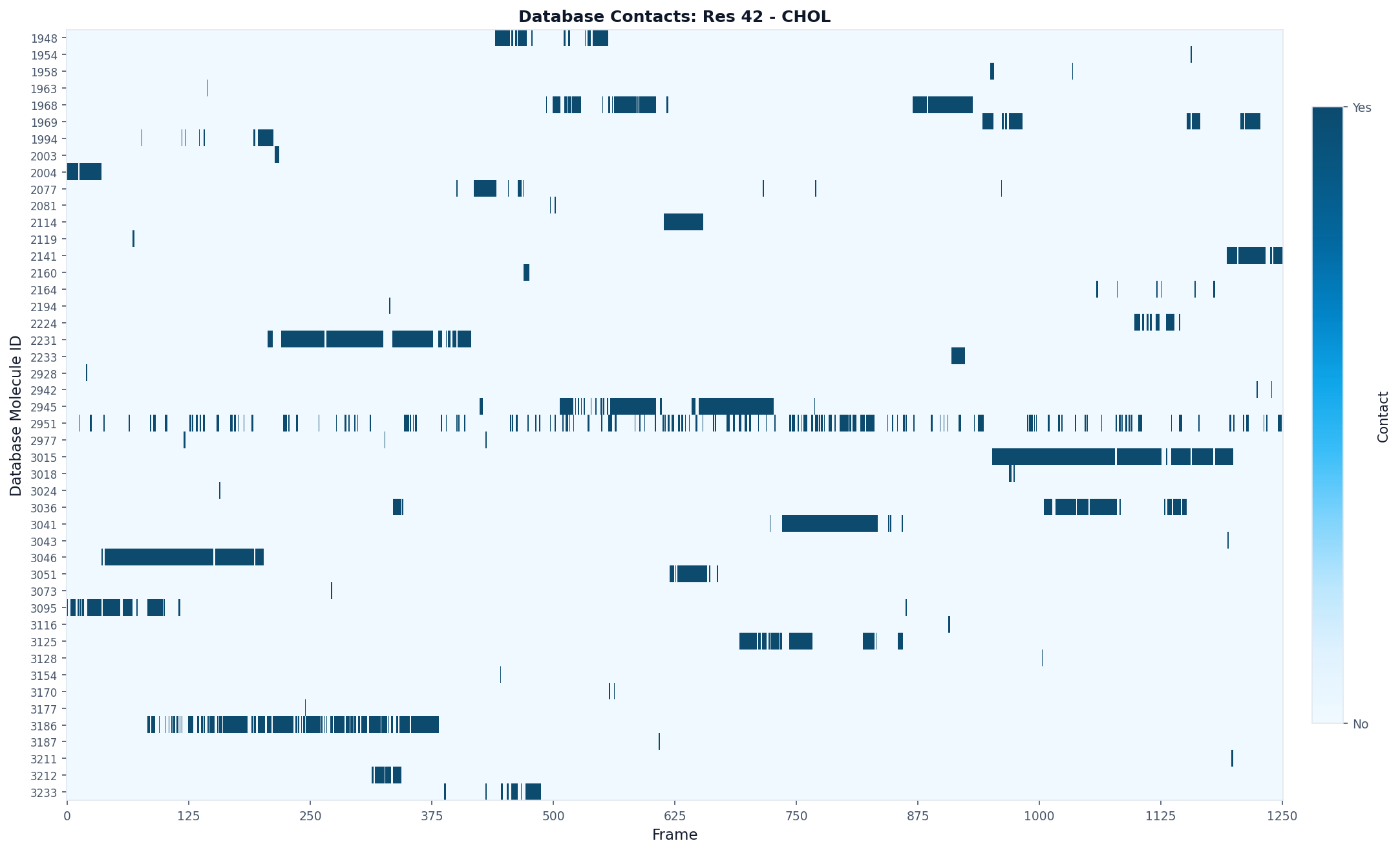
Database Contacts Analysis
Use when: You want to track which specific lipid molecules contact a particular residue.
# Track individual lipids contacting residue 42
result = contacts.analyze(
    "database_contacts",
    query_residue=42,
    database_type="CHOL"
)

# The result shows which lipid molecules (by ID) contact the residue
# and in which frames

# Visualize as a per-lipid timeline
fig, ax = plot("database_contacts_heatmap", result, max_display_cols=2000)
fig.savefig("residue42_database_contacts.png", dpi=150, bbox_inches="tight")
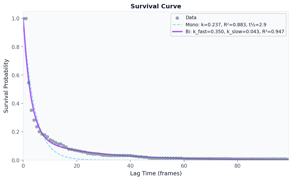
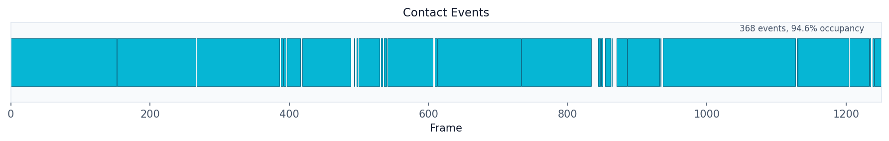
Kinetics Analysis
Use when: You want to measure binding/unbinding dynamics, residence times, and survival probabilities.
# Analyze binding kinetics for a specific residue
result = contacts.analyze(
    "kinetics",
    query_residue=42,
    database_type="CHOL",
    mode="accumulated",  # Sum all lipids of this type
    fit_survival=True,   # Fit exponential decay
    max_lag=100          # Maximum lag time for survival curve
)

# Access kinetics metrics
kinetics = result.data["kinetics"]
print(f"k_off: {kinetics['koff']:.4f}")
print(f"k_on: {kinetics['kon']:.4f}")
print(f"Mean residence time: {kinetics['mean_residence_time']:.2f} frames")
print(f"Occupancy: {kinetics['occupancy']:.2%}")
prolint.analysis.kinetics - INFO - Computing kinetics for residue 42 (mode=accumulated)
k_off: 0.1697
k_on: 5.4925
Mean residence time: 5.89 frames
Occupancy: 94.64%
Tip
Use mode="individual" with database_residue=<database_id> to analyze kinetics for a specific database molecule rather than all molecules of a type.
# Visualize survival curve
fig, ax = plot("survival_curve", result)
fig.savefig("survival_curve.png", dpi=150, bbox_inches="tight")
# Visualize residence time distribution
fig, ax = plot("residence_distribution", result)
fig.savefig("residence_distribution.png", dpi=150, bbox_inches="tight")
# Show contact events timeline
fig, ax = plot("contact_events", result)
fig.savefig("contact_events.png", dpi=150, bbox_inches="tight")
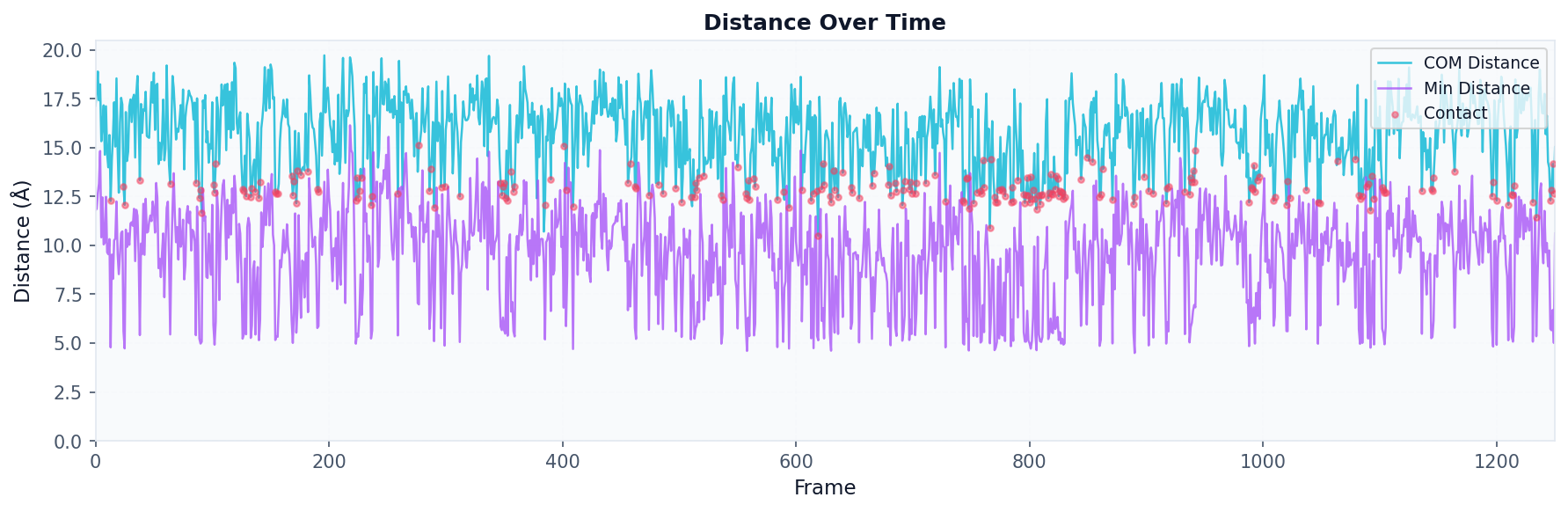
Distance Analysis
Use when: You want to track the distance between a specific query residue and a database molecule over time.
# Track distance over trajectory
result = contacts.analyze(
    "distances",
    query_residue=42,
    database_residue=2951,     # Specific database ID
    compute_min_distances=True,
    compute_positions=True
)

# Visualize distance over time
fig, ax = plot("distance_timeseries", result)
fig.savefig("distance_timeseries.png", dpi=150, bbox_inches="tight")
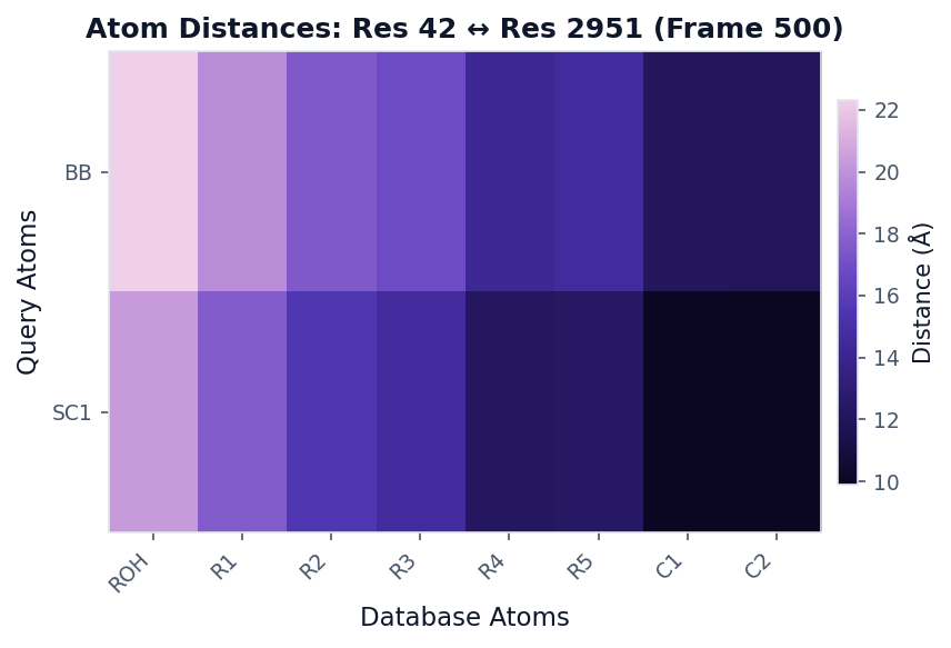
Atom Distances Analysis
Use when: You want a detailed atom-atom distance matrix at a specific frame.
# Get atom-level distances at frame 500
result = contacts.analyze(
    "atom_distances",
    query_residue=42,
    database_residue=2951,
    frame_idx=500
)

# Visualize as distance matrix
fig, ax = plot("distance_heatmap", result, colorscheme="mako", figsize=(6, 4))
fig.savefig("atom_distances.png", dpi=150, bbox_inches="tight")
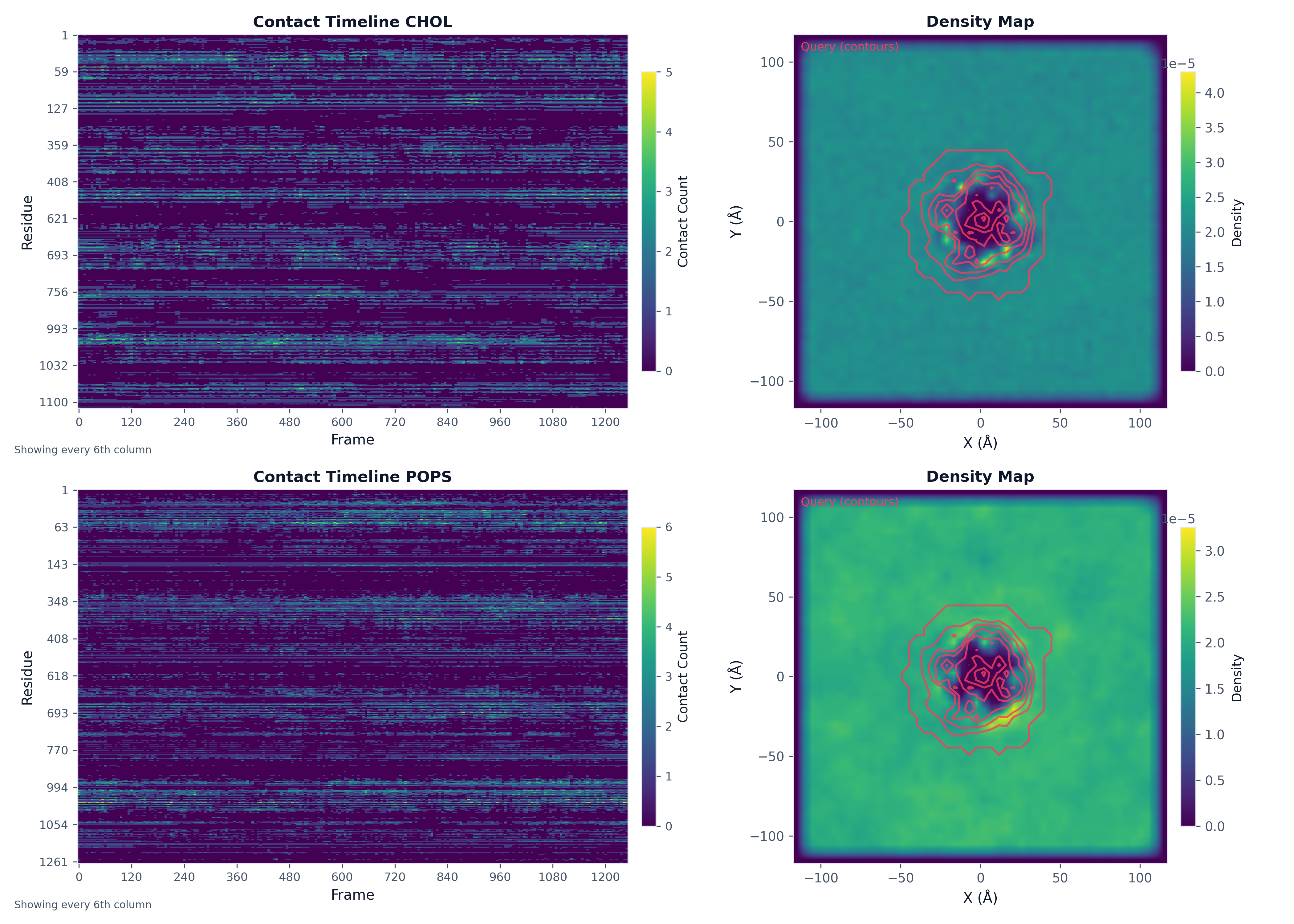
Multi-Panel Figures
Create complex figures with multiple plots:
import matplotlib.pyplot as plt

# Run analyses
density_result_chol = contacts.analyze("density_map", bins=50, database_types=["CHOL"])
ts_result_chol = contacts.analyze("timeseries", database_type="CHOL")
density_result_pops = contacts.analyze("density_map", bins=50, database_types=["POPS"])
ts_result_pops = contacts.analyze("timeseries", database_type="POPS")

# Create figure with subplots
fig, axes = plt.subplots(2, 2, figsize=(14, 10))

# Plot into each axis
plot("heatmap", ts_result_chol, ax=axes[0, 0], title="Contact Timeline CHOL")
plot("density_map", density_result_chol, ax=axes[0, 1], show_query_contours=True)
plot("heatmap", ts_result_pops, ax=axes[1, 0], title="Contact Timeline POPS")
plot("density_map", density_result_pops, ax=axes[1, 1], show_query_contours=True)

plt.tight_layout()
fig.savefig("analysis_multipanel.png", dpi=300)
Exporting PDB with B-factors
Write a PDB file with metric values in the B-factor column for visualization in PyMOL, VMD, or any molecular viewer:
from prolint.plotting import write_pdb

write_pdb(
    contacts,
    metric="occupancy",
    target_resname="CHOL",
    filename="occupancy.pdb",
    frame=0  # Reference frame for coordinates
)
Visualize in PyMOL:
load occupancy.pdb
spectrum b, blue_white_red
Visualize in VMD:
mol load pdb occupancy.pdb
mol modcolor 0 top Beta
mol modstyle 0 top NewCartoon
Styling and Color Schemes
ProLint provides consistent styling and several color schemes for publication-ready figures.
Apply ProLint Style
from prolint.plotting import apply_prolint_style

apply_prolint_style()  # Apply to all subsequent plots
Available Color Schemes
Scheme |
Description |
Best For |
|---|---|---|
|
Perceptually uniform, colorblind-friendly |
General use, heatmaps |
|
ProLint’s scientific scheme |
Publication figures |
|
Sequential blue gradient |
Single-variable data |
|
Dark-to-light purple/teal |
Dark backgrounds |
|
Colors by amino acid type |
Residue visualizations |
|
10-color palette |
Discrete categories |
# Using different color schemes
fig, ax = plot("heatmap", result, colorscheme="prolint")
fig, ax = plot("residue_metrics", result, colorscheme="amino_acid")
fig, ax = plot("density_map", result, colorscheme="mako")